 The adsense program provides great flexibility in the way users interact with the page ads. Although Google provides you with a standard color template, it doesn't mean that you have to stick to it by any means.
First, notice that having ads with a color that doesn't match you page style is bad for your click through rate. You should in general have ads matching the colors of your page as much as possible. This is necessary to give the idea of fluidity, so the visitor doesn't feel compeled to visually skip your ad.
There are several ways to change colors in your ads. The main tool to do this is in the Google adsense page itself. If you click on "color palletes", you will be sent to another page where you can change every aspect of the colors in your adsense ad.
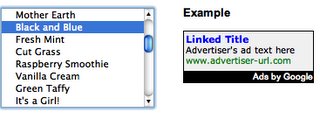
The types of colors you can change are:
- border colors: usually it is green, you should change to the color of your background
- link color: the color the main links will appear. Should also match the scheme in your page
- background color: another color that should me made equal to your background, to break any separation between your page and the targeted ads.
- text color: this is the text of the ad. Again, should be similar to the color of text in your page.
Using ad color schemes carefully, you can create very appealing ad units. This is make users more attentive to the Adsense results and consequently improve your results.
Technorati Profile
0 comments:
Post a Comment